In the realm of art, mastering color theory is crucial for producing visually appealing works. Understanding primary colors and their importance in art is a key component of color theory. These fundamental colors serve as the building blocks for all other shades, allowing any color to be created by mixing them in different combinations. Gaining a thorough knowledge of the significance of primary colors in art lays a solid groundwork for further learning and development.
Understanding Primary Color Theory
Color Wheel Basics
The color wheel is a visual representation of colors arranged according to their chromatic relationship. Primary colors are the foundation of color theory in art and are essential in creating other colors.
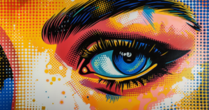
In the world of art and design, the primary colors include red, blue, and yellow. These colors cannot be created by mixing other colors together but are instead the building blocks of all other colors on the spectrum.
By mixing two primary colors, you can create secondary colors. For instance, red and blue create purple, blue and yellow create green, and red and yellow create orange.
In addition to primary and secondary colors, the color wheel also includes tertiary colors, which are obtained by mixing primary and secondary colors.
Some key concepts related to primary colors you should be aware of are:
- Hue: The basic color itself (e.g., red, blue, or yellow)
- Value: The lightness or darkness of a color
- Intensity: The brightness or dullness of a color
Color Harmony

Understanding how colors work together in harmony is crucial in creating visually appealing artworks. Color harmony refers to the combinations of colors that are considered pleasing to the eye. A few popular color schemes include:
- Complementary: Colors that are opposite to each other on the color wheel (e.g., blue and orange)
- Analogous: Colors that are next to each other on the color wheel (e.g., blue, green, and yellow)
- Triadic: Three colors that are evenly spaced on the color wheel (e.g., red, yellow, and blue)
As an artist, it’s essential to familiarize yourself with color theory and the importance of primary colors in art. By understanding the color wheel basics and the idea of color harmony, you can create more aesthetically pleasing artworks and improve your overall skills as a creative individual.
Primary Colors Defined
Characteristics of Primary Colors
Primary colors are the foundation of color theory in art. These colors are red, blue, and yellow. They possess unique characteristics that set them apart from other colors:
- Primary colors cannot be created by mixing other colors.
- They can be combined to create a vast array of secondary and tertiary colors.
- They are essential for any artist’s palette.
Understanding the unique properties of primary colors helps you in creating visually appealing and harmonious color schemes in your artwork.
Primary Colors in Various Color Systems
There are different color systems in which the primary colors can be represented. Here are some commonly used color systems:
- RYB (Red, Yellow, Blue): This is the traditional color model used in art and painting, with red, yellow, and blue being the primary colors. Mixing these colors results in secondary colors like green, orange, and purple.
- RGB (Red, Green, Blue): This is an additive color model used primarily in digital media, such as computer displays and television screens. In this system, the primary colors are red, green, and blue. By combining these colors, you can create a wide array of hues, including the secondary colors cyan, magenta, and yellow.
- CMY (Cyan, Magenta, Yellow): This is subtractive color model, typically used in color printing. In this system, the primary colors are cyan, magenta, and yellow. When you mix these colors, you create the secondary colors red, green, and blue.
Each color system has its own set of primary colors, and selecting the appropriate system depends on the specific requirements of your art project. Mastering the use of primary colors in different color systems can help you in creating visually striking and impactful artworks.
Role of Primary Colors in Artistic Composition
Mixing Colors
Knowing your primary colors allows you to create a vast array of shades and hues by combining them in different proportions. For instance, when you mix equal parts of red and yellow, you create orange, mixing blue and red produces purple, while blending blue and yellow results in green.
Moreover, you can produce tertiary colors by combining primary and secondary colors, such as mixing blue with green to obtain blue-green. By continually adjusting the ratio of primary colors and layering them, you can achieve a diverse color palette that enables you to create unique and expressive artworks.
Color Schemes
A well-balanced color scheme enhances your artwork’s visual appeal and adds depth to your compositions. Knowledge of primary colors and how to mix them helps you create various color schemes. Some common schemes include:
- Monochromatic: This scheme focuses on a single hue, varying its shades, tints, and tones. By only using one color, you create a harmonious look in your artwork.
- Complementary: This scheme uses two colors opposite each other on the color wheel, such as red and green. It adds contrast and visual interest to your composition while maintaining balance.
- Split Complementary: A variation of the complementary scheme, it uses a base color and the two colors adjacent to its complement on the color wheel. For example, if your base color is red, you would use blue-green and yellow-green as the complementary colors.
- Triadic: This scheme employs three evenly spaced colors on the color wheel, like red, yellow, and blue. It creates a vibrant and harmonious look, while offering plenty of versatility in your composition.
Experimenting with different color schemes and combinations helps you find what works best for your artistic style. Don’t be afraid to challenge yourself and explore various approaches to incorporating primary colors into your artwork.
Doing so will not only improve your understanding of color theory but also enable you to create even more captivating and visually stunning compositions.
The Psychological Impact of Colors
Emotional Responses
Different colors impact our emotions and behavior in various ways. When you encounter various hues, you may experience a range of emotional responses that can alter your mood and perception.
Let’s take a brief look at some common colors and their associated emotions:
- Red is often associated with energy, passion, and excitement.
- Blue can evoke feelings of calmness, peace, and trustworthiness.
- Yellow is known to create sensations of happiness, warmth, and optimism.
- Green generates a range of emotions, from peace and growth to envy.
In general, warm colors like red, yellow, and orange tend to generate more energetic emotions, while cool colors like green, blue, and purple are more calming and soothing.
Color Psychology in Art
Understanding color psychology is critical to creating impactful art that effectively conveys your intended message. Artists utilize color theory to create harmonious compositions and evoke specific emotions in their audience.
For instance, if you want your artwork to evoke feelings of comfort and warmth, consider incorporating warm colors like red, yellow, and orange in your piece. On the other hand, if you aim to achieve a more tranquil and calming atmosphere in your artwork, cool colors like green and blue would be more appropriate.
Experimenting with color combinations and understanding their psychological effects can enable you to enhance your artistic expression. Keep in mind that these emotional associations may vary among individuals due to cultural and personal experiences. Thus, the key is to find a balance between your artistic vision and the emotions you want to evoke in your viewer.
Famous Artworks and Primary Colors
Historical Use of Primary Colors
Primary colors have played a significant role in art history. Historically, artists have used primary colors (red, yellow, and blue) to create a wide range of hues. These colors cannot be created by mixing other colors, making them essential in a painter’s palette.
In the Middle Ages, primary colors were often used in religious and symbolic art. For example, the blue pigment ultramarine, made from the precious stone lapis lazuli, was greatly sought after and reserved for the portrayal of the Virgin Mary in her signature blue robe.
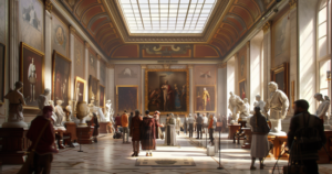
Another famous artwork, The School of Athens (1509-1511) by Raphael showcases the bold use of primary colors in Renaissance art. You can easily spot red, yellow, and blue brilliantly arranged to create a visually harmonious composition.
Modern and Contemporary Examples
Modern artists have continued to embrace primary colors in their works as well. For instance, Piet Mondrian is a notable modern artist who is renowned for his abstract compositions using primary colors. Mondrian’s artwork, such as Composition II in Red, Blue, and Yellow (1930), demonstrates the power of primary colors to create a visually compelling piece.
In contemporary art, famous artists like Wassily Kandinsky and Pablo Picasso utilized primary colors to express emotions and concepts through their paintings. Kandinsky’s Improvisation 31 (Sea Battle) (1913) and Picasso’s Woman in Striped Armchair (1941) are prime examples of how primary colors can be applied in inventive ways.
Moreover, the Pop Art movement saw artists like Roy Lichtenstein and Andy Warhol implement primary colors in their iconic works. Lichtenstein’s comic book-inspired Whaam! (1963) and Warhol’s Marilyn Monroe series (1962) are exemplary pieces.
In a nutshell, primary colors have proven to be fundamental in the world of art. Whether it’s historical masterpieces, modern paintings, or contemporary expressions, primary colors leave an enduring impression.
Are you already familiar with the primary colors? Please leave us a comment with your experiences.
What are the 5 secondary colors?
The five secondary colors are orange, green, and violet. These hues are created by mixing two primary colors together: orange from red and yellow, green from yellow and blue, and violet from blue and red. They expand the color spectrum and are essential in color theory and art.
Is black a real color?
Black is a real color perceived when an object absorbs all light. In terms of pigment and light, it is a real color. In art and design, black plays a crucial role, providing contrast and depth. While debates exist due to color theory, black is a fundamental element in visual expression.
What is a warm color?
Warm colors, such as red, orange, and yellow, are associated with heat, energy, and passion. They evoke a sense of warmth, vibrancy, and dynamism. In art and design, warm colors often convey a lively and inviting atmosphere, creating visual impact and emotional intensity.
Is white a primary color?
White is not a primary color in traditional color theory. Primary colors are red, blue, and yellow, which are used to create all other colors. White is considered a neutral color, often used to lighten or tint other colors, and it plays a crucial role in color mixing and design.